
3 Tips for Making Thoughtful Color Choices
Color theory for illustrators can seem complicated, but most children learned at least the basics of color theory at a young age - primary colors, secondary colors, and lots of ROYGBIV Rainbows. For many of us, thoughts about colors and their selection, combinations, saturation, meaning, etc, stopped there. For practicing illustrators, however, color theory and its impact on illustration cannot be ignored. Below are 3 tips for thoughtfully considering color theory and its impact in your work.
1. Consult Existing Brand When Incorporating Color Theory into Your Illustrations
Depending on the project, you may be asked to illustrate a character or brand that already exists. If this is the case, it’s vital to have an understanding of your character’s universe and/or associated brand when considering what other elements of color theory for illustrators to apply.
The creator has likely already put a lot of thought into colors - they may even have a style guide that dictates what colors and elements should be found in the character’s surroundings.
For example, I recently completed illustrations for a children's book called This is My Place (to be published in December through Mascot Books). The book reminds children of all the fun experiences they and their family can have while being treated at the MVU Medicine Children’s Hospital.
As you can see from their site, the hospital already has a clear brand, so when I began thinking about backgrounds for the different spreads, I was sure to take the colors in their logo into consideration. The authors not only loved the illustrations, but also loved that their existing brand was incorporated into the story.
2. Reflect the Mood
When selecting colors, it’s important to remember that different colors, as well as varying saturations and hues of those colors, can represent and convey different meanings and moods.
One of my favorite examples from my own work of using color to reflect mood is in The Littlest Rain Cloud. Darker colors/shadows are used to reflect the sadness and worry the characters are feeling.
In particular, in the 7th spread that shows 4 different scenes with the littlest rain cloud attempting to rain, brighter colors are used when the littlest rain cloud is thinking and making an effort, but darker colors are used in the scenes where the cloud is saddened and deterred by its lack of success.
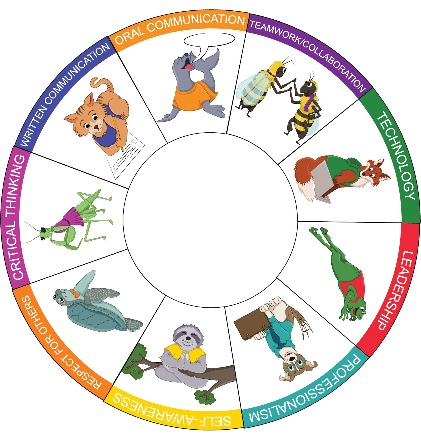
3. Consider Complements
When creating illustrations with lots of color, which I frequently do, it can sometimes be a challenge to determine which colors to use together. When illustrators consider color combinations and schemes, a good starting point for illustrators considering the implications of color theory is to think about color complements, because they allow for a distinct variation in color while still adhering to a color scheme.
For example, when I created a series of stickers representing the NACE competencies, I added attire to each character and used that character’s complementary color for their outfit. This created more colorful and visually interesting individual stickers.
Color options in illustration are infinite, but by keeping the history of your subject in mind, using color to reflect the mood and emotions, and selecting and adhering to a specific color scheme, you’ll be able to make color choices and incorporate color theory in a way that enhances your work and its impact.